Project Type: Freelance
Role: Graphic Designer
Deliverables:

NightMarket is a small, New Hampshire startup in its early stages, with a huge dream. The company intends to take a multi-faceted approach to the creation of, not only a brand, but a culture. They are working diligently to develop software, implement AI platforms, create NFT entities, and promote unity within our society. Unfortunately, they ran into an issue with their domain, and we are currently working to rebrand the company as uNight, but more on that later! For now, let's see NightMarket as it was.
The mission statement of NightMarket is as follows: “To build a community for independent brands, artists, streetwear, and sneaker resellers to collaborate and scale their business with top of the line software.” Their plan for the implementation of this mission statement read: “by creating a community of collaboration and innovation within the night market team and among the design of the platform.”
Click any Image to Enlarge
Logo Design
(Two Color Palette Options)
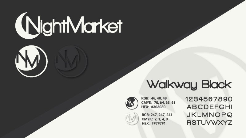
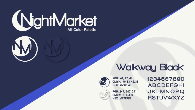
This client was very involved in the creation of the company logo. The crescent with connected text elements were not negotiable, and the font was to be displayed with very tight kerning. I drafted several variations, but this version was instantly adopted as “exactly what he was looking for. I would normally present multiple iterations using differing graphic elements; this time around my artistic freedom was someone limited. I presented this using two color palettes, both using colors of his choosing, and the first seemed to stick, at least as far as brand identity is concerned.
Stationery Set
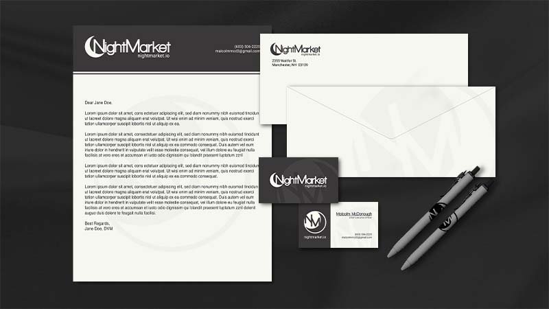
I kept the design very simple for the stationery items and brand identity. I've included business cards, letterhead, envelope, and ink-pen mockups. I must admit that I do enjoy the old, watermarked logo trick, this is present on all included pieces. I feel that the brand is pulled together well in this set, and I enjoy the low contrast, almost grayscale nature of the palette.
Print Ready Materials
This poster, designed to promote a for charity festival to be hosted by NightMarket, was set up for commercial printing via PDF but never made it to the shop as the event was delayed. The founder had recently sent a random, simple doodle of an astronaut holding a balloon, and I decided to elaborate on that. NightMarket embraces space as a primary theme from here on out.
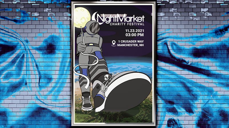
Website Mockups
This is where the space theme begins to become apparent. I created a version that would adhere to branding guidelines, but this was simply not an option. They had already been working with the idea, which is quite complex in terms of web dev. I was asked to create a minimal space-craft interior to overlay an illustrative space background along with a HUD for info display on each planet.
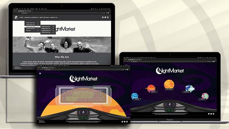
As I mentioned before, Nightmarket was unable to obtain a domain, at least within the context of proper SEO. This ultimately led to the decision to more or less, start from scratch. I have recently (January 2022) been working with them on getting a rebrand together under the name uNight. Though, I regret the time and effort that they have put into NightMarket, I honestly believe that this is a better name for the brand and as such, comes with a stronger branding platform.
Their small, but dedicated team plans to implement the company in much the same way, using space as their primary theme. Given the broad spectrum of services and products that they intend to develop, I foresee a need to use uNight as an umbrella that oversees several other brands that would need separate branding packages, though, it is given that this decision is not mine to make.

Logo Design Process
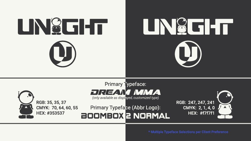
Because I am currently working on this project, I thought this may be a nice opportunity to share a little about my process for logo design. In this case, we again, started with the crescent that was a must-have for NightMarket. However, this time around, I feel that we found a hidden gem that is much more creative and original.
Getting back to the process, please excuse the terminology, but I like to say that I begin by “throwing up on the screen”. I rarely sketch by hand; I usually just open Illustrator and have at it. Sometimes something feels good right away, sometimes I create a lot of nonsense that's scattered around the artboards. I can often find small elements within this nonsense that can come together to create something that does make sense. In this case, I went back to some of the client's sketches that were never meant as logos. “Astoro”, as he has dubbed the astronaut fits well with the overall theme of their website, and I decided to put him to use. The idea caught on, and it just developed from there until I found a happy place for the client!
You may note that the secondary logo maintains the crescent as well as a differring font? I know, and I made every effort to create an icon style abbreviation using "Astoro" that could be used as an icon for the software developement team as well, but this was a hard "no". That's okay, after all, this is not my company, it should represent them the way that they choose, but if you are a graphic designer wondering why I unglue a cohesive brand, this is your answer.
Finalizing the Logo
This is where we landed on the logo. This involved a lot of typography edits, the font is only available in 900, italic style. I thinned it out, cut out a few extra spaces, lowered contrast, and rounded outer corners, and ajusted kerning to get this look. Despite our differring opinions on a few things, I have a happy client! The style and usage guide was just delivered, and then on to the next thing!
