Project Type: Professional Development
Role: Concept Graphic Designer
Deliverables:
Elevated Craft Brewing Co. is a high end microbrew in Boulder, CO. Their focus is on quality & consistency within their product line. They offer a full product line that is distributed via can or growler filling stations. Their name incorporates both the location altitude & the pride taken in creating a brand that stands a bit taller than the rest.
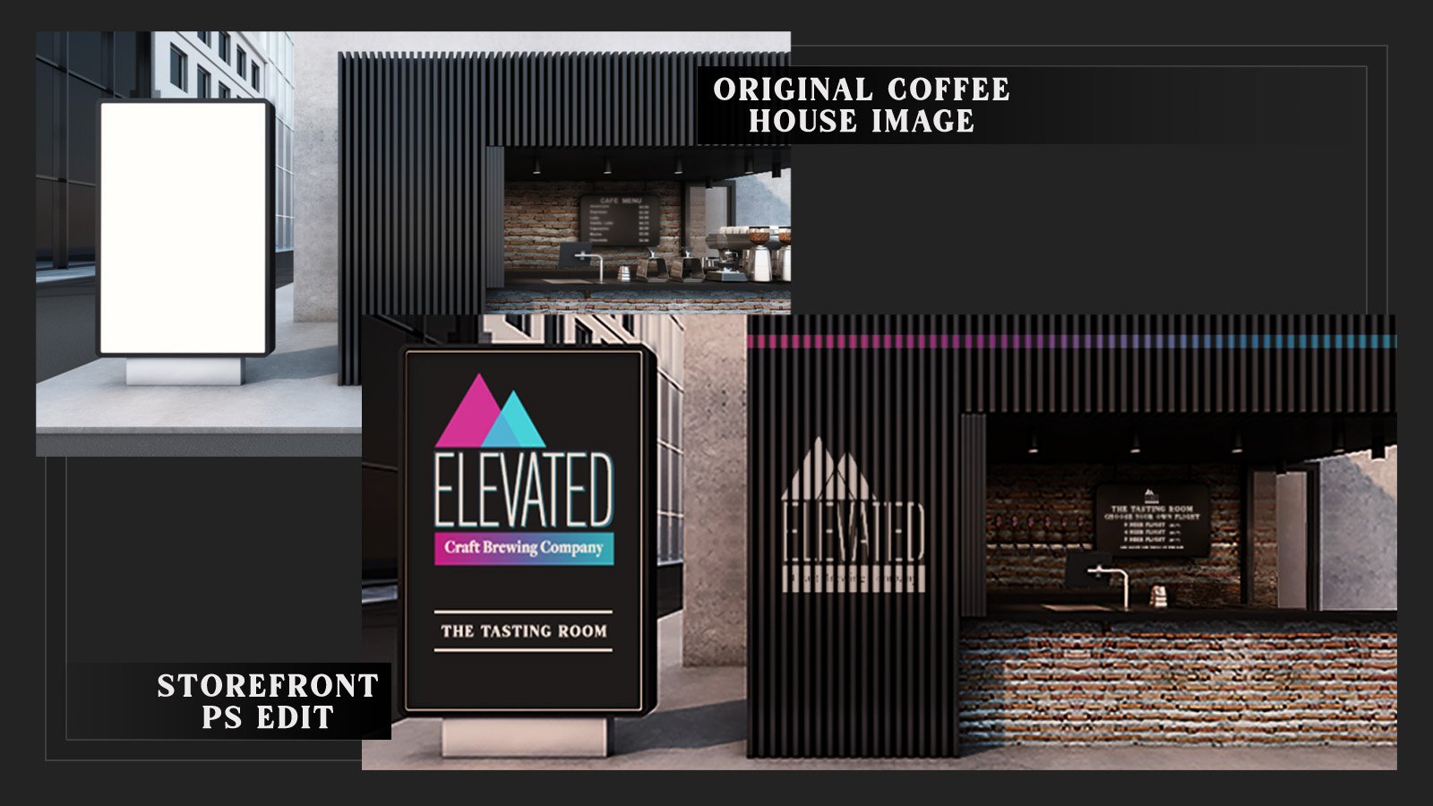
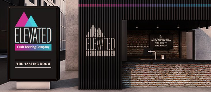
The storefront of the brewery offers an indoor/outdoor tasting room that serves three, four, and five beer flights that may be accompanied by a curated selection of tapas meant to compliment the flavor profile of the selected beverages. The image to the right was edited to create a mockup that embraces the aesthetic that I would envision for the tasting room. (Click the Image to view the transformation from coffee shop to tap room!)
Click any Image to Enlarge
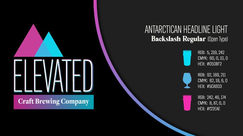
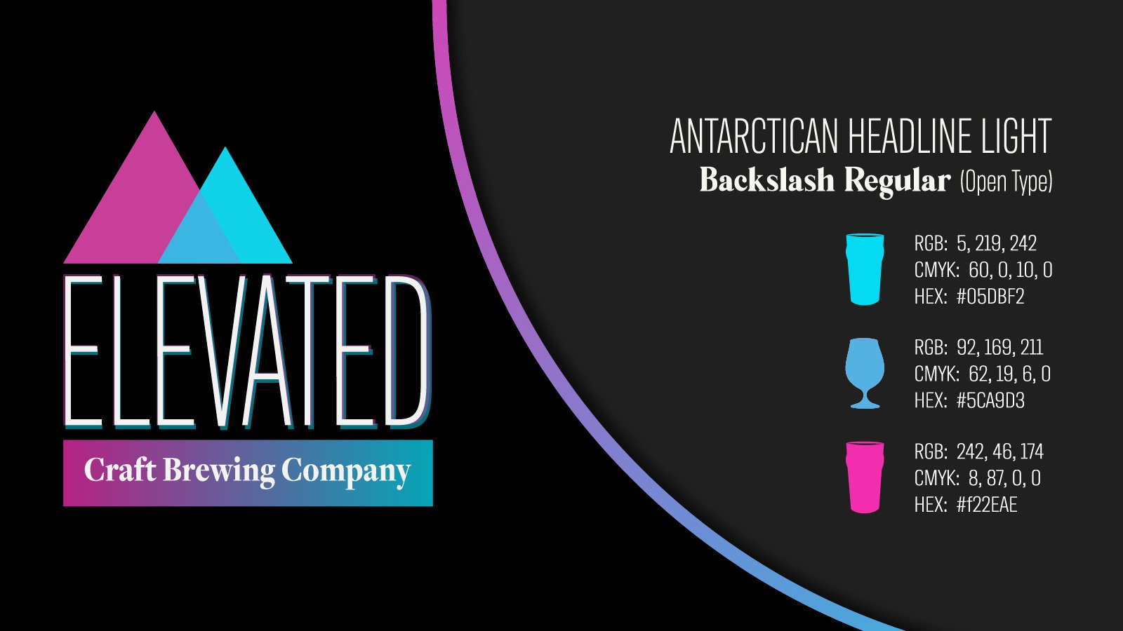
Logo Design
The logo for Elevated incorporates an “elevated” typeface with a complementary selection that is reabable & works well as body text. The graphic elements are based on the terrain of the Rockies. This theme carries throughout; each beverage name & label design is based on a mountian that accents the beverage type. While uncommon in many logo types, the gradient is key to the feel of the brand.
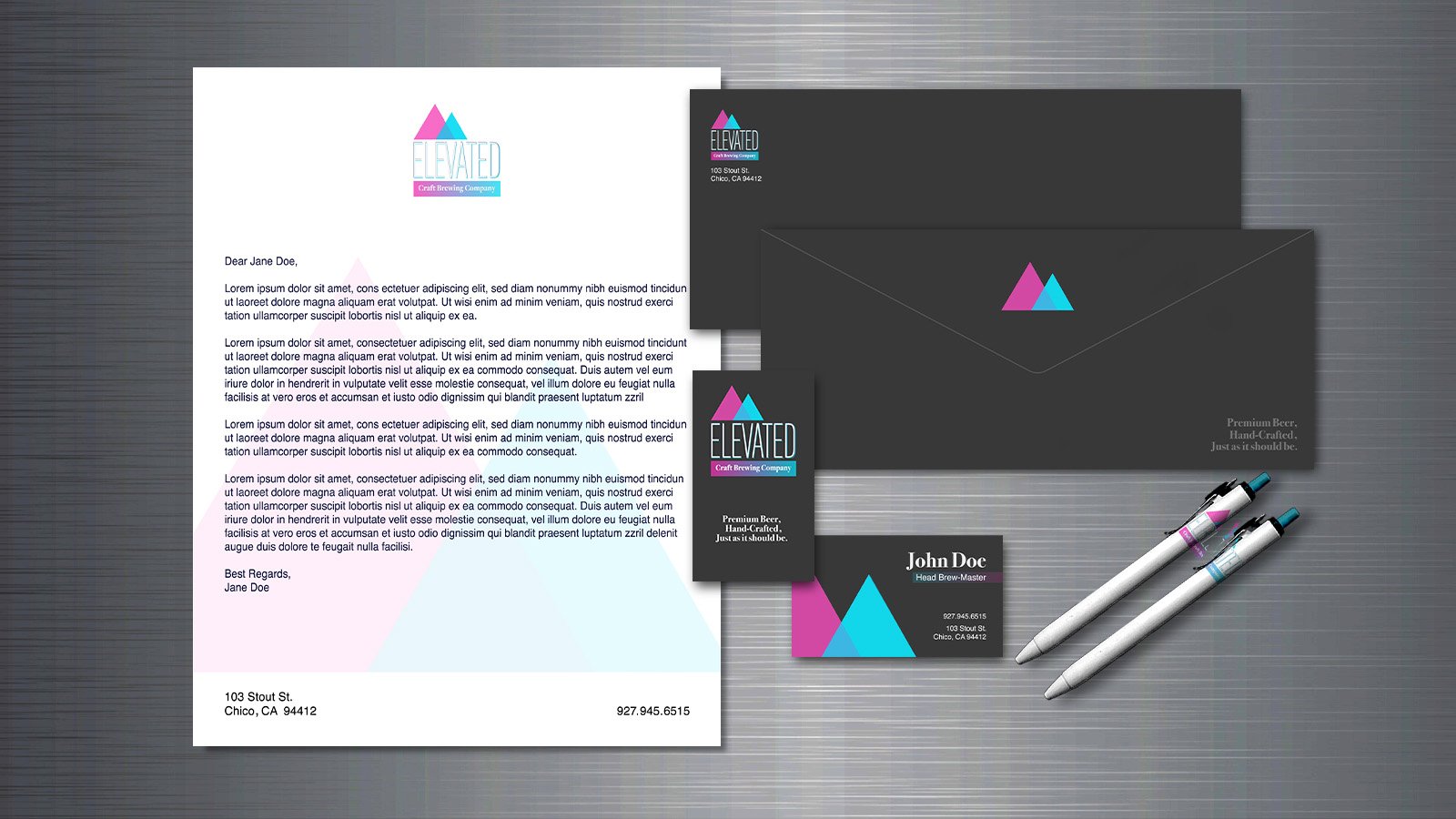
Stationery Set
This is a simple mockup of brand identity & logo usage for Elevated Brewing. I have included business cards, letterhead, envelope (front & back), and ink-pen design mockups. The graphic elements are consistent throughout, pulling each piece together as a single unit.

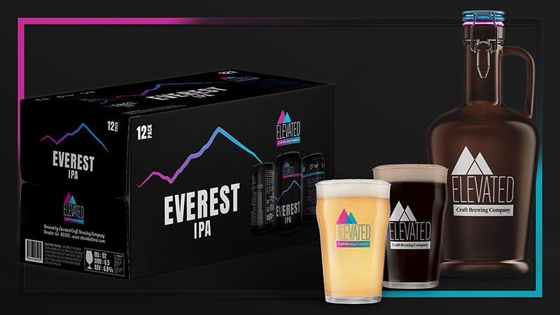
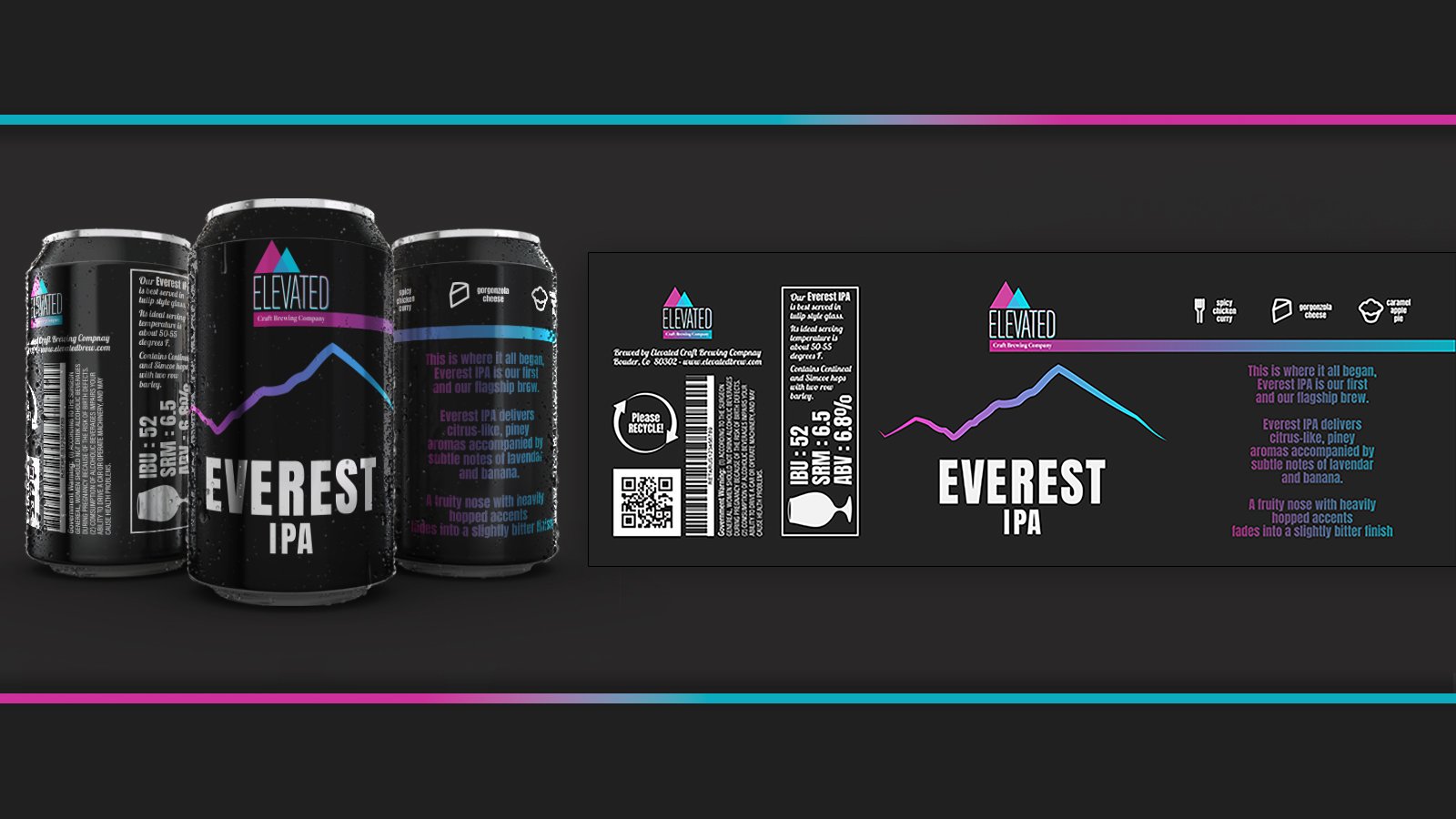
Packaging & Drinkware
I have mocked up a single unit package design for the flagship brew of the company, Everest IPA. This rendering also includes the refillable growler that would be purchased at the brewery along with a few examples of drinkware. This would likely expand into several glass types that would provide the best drinking experience for their premium beverages.
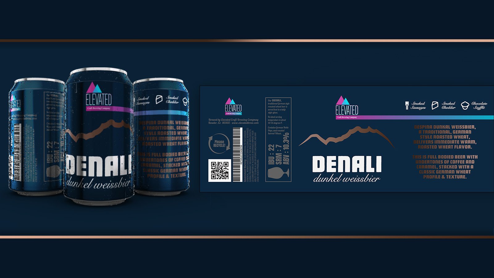
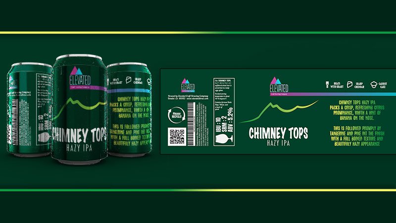
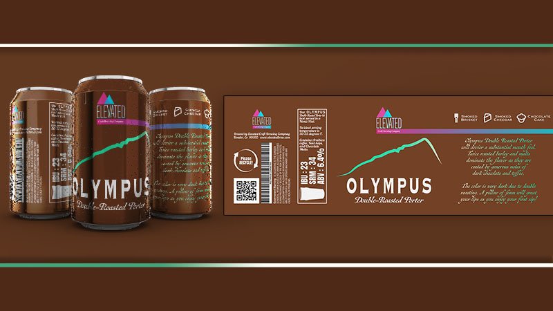
Product Design - Beverage Can Labels
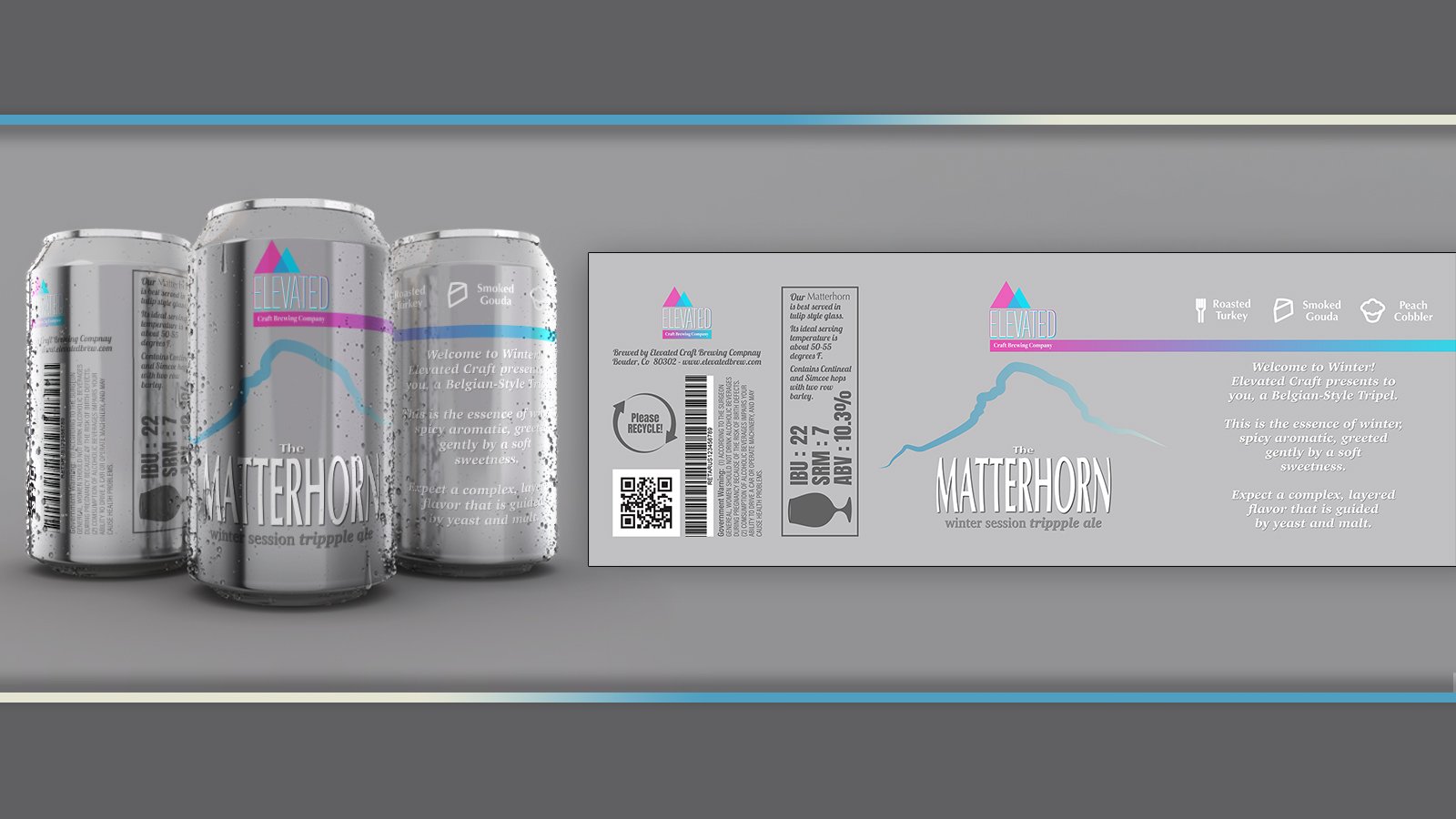
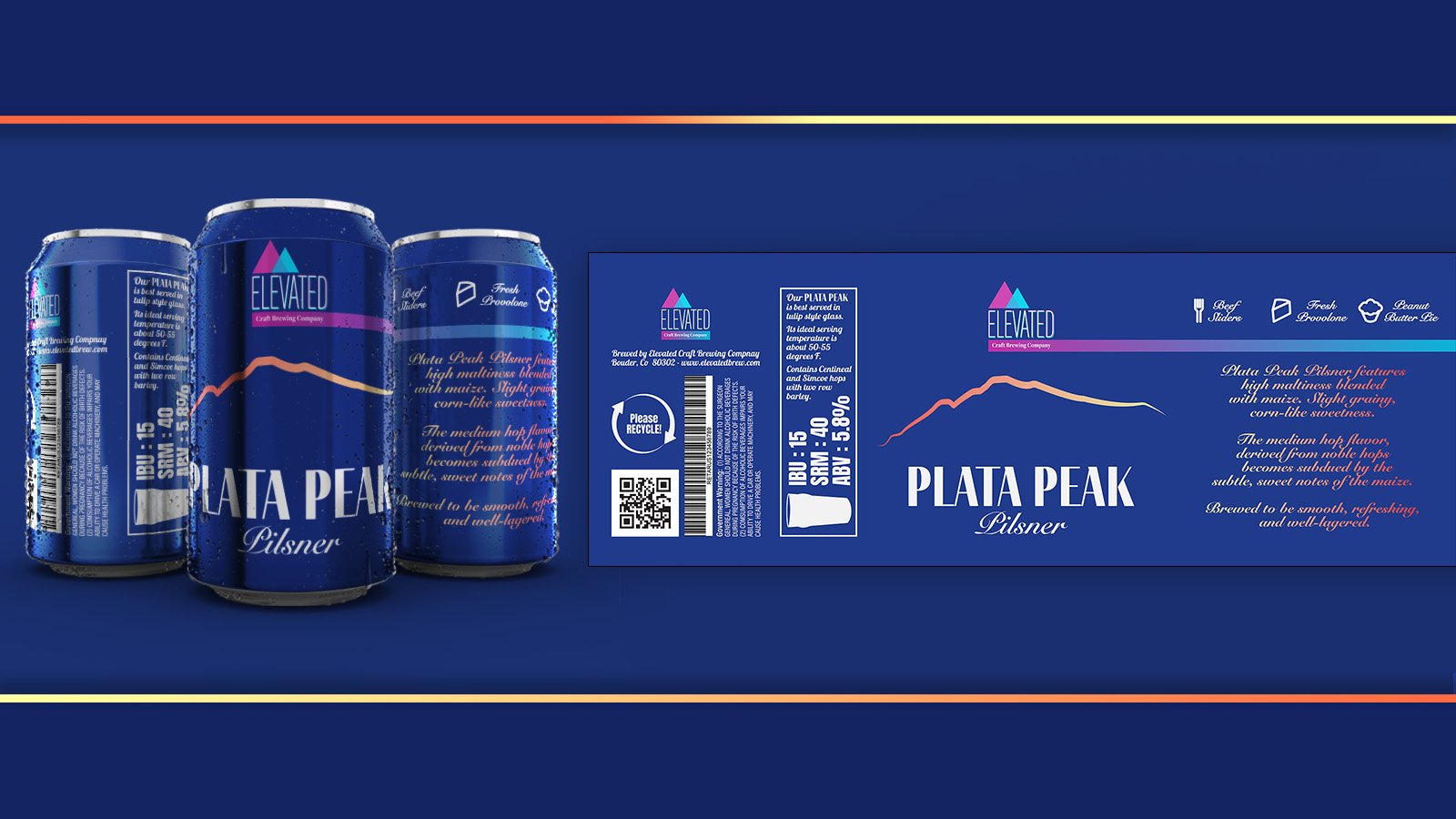
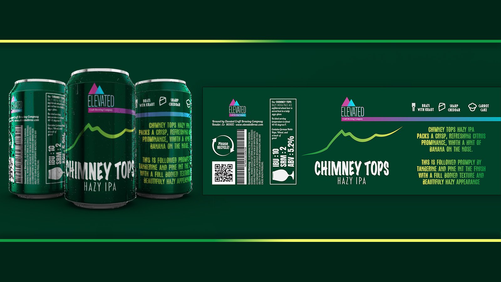
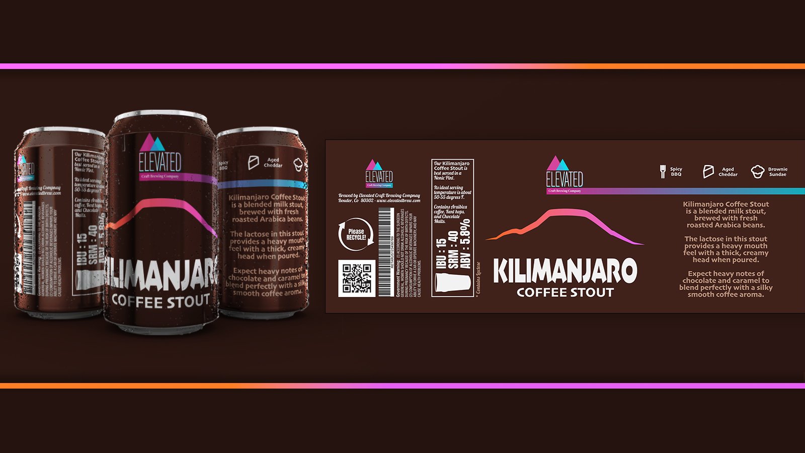
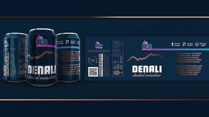
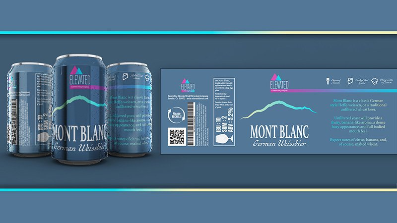
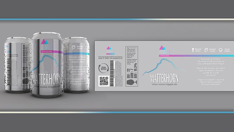
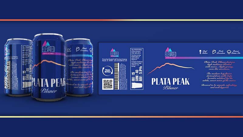
As stated above, each beverage from Elevated Craft Brewing Company's product line is named for a mountain that is appropriated for at least one specific characteristic of the beer style. This could include flavor profile, appearance, regional associations, or other elements.
A few examples of this could be: “Everest IPA”, their flagship brew; Mt. Everest is likely the most well-known mountain in the world, reaching the highest elevation relative to sea level. This beer, being the flagship, takes on the Elevated brand's color palette. “Mount Blanc”, blanc being the French work for white, symbolizes the light color of this beer. Finally, The Matterhorn is widely known as one of the world's most dangerous ski slopes. It would stand to reason that their seasonal triple, touting an ABV of 10.3%, could be a slippery slope, indeed… Hence the name, “Matterhorn Winter Session Trippple” (I know about the extra P!). This one uses a white and light blue color palette to symbolize the season.


Product Design - Design Rational
The central theme of the product line is a minimal representation of the silhouette of the associated mountain, each with its own gradient color scheme. As with most brewing companies, the brand fonts are only respected in the logo, the can design takes the product being represented into account for enhanced representation and a little variance to keep your favorite style visible at the retailer!