
Project Type: Professional Developement
Role: Concept Graphic Designer
Deliverables:
Rise & Shine Coffee House is one of my older projects that I have recently revisited. The shop is known for its comfortable, and intimate feel along with its specialty in barista latte art, and a being a gathering place for those that are artistic by nature.
The owner is a lover, patron, and promoter of the local art scene and hosts classes either on the shop's patio (weather permitting) or by transforming one of the rooms in the shop's, newly acquired 1910s era colonial style homestead into an art studio or stage in the evenings. They have exceeded their expectations for success, and decided to rebrand using a more modern theme, and warmer secondary color palette; both the old and new branding packages will be presented below!
They do charge a nominal fee for the events and classes which is appropriated to the operational costs of hosting them as well as to fund scholarships to help facilitate the educational needs of local art students via a 50% donation of all proceeds earned from these classes and events. I have designed a menu, table tent, business card, loyalty rewards card, to-go packaging, as well as a merchandise and clothing package for this business.
Click any Image to Enlarge
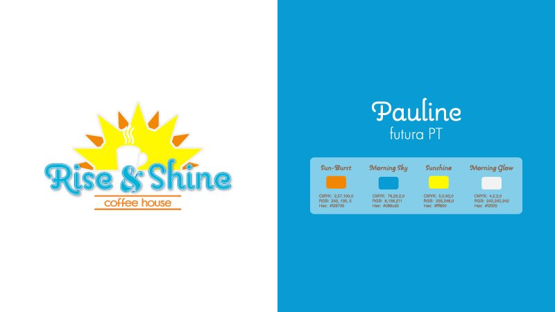
Initial Logo Design
Okay, I'll begin by saying, “I know”, by current standards this logo is a bit overdone and gaudy. However, what I have found in dealing with clients is that I can discuss cohesive branding & intentional messaging as much as I want, but they generally want what they want. In this case, the project is based on my wife of 12 years, and this one was the one!
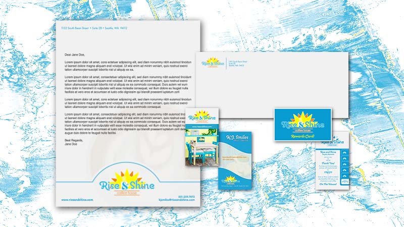
Stationery Set
The stationery set embraces the overall feel of the logo and shop using the same fonts, colors, and graphic styles. I added a customer loyalty rewards card to the set that would offer two options for the rewards system, the first being a free beverage with 1 card, the second being a free meal with the redemption of 3 cards. I tried to keep the information minimal and accessible.
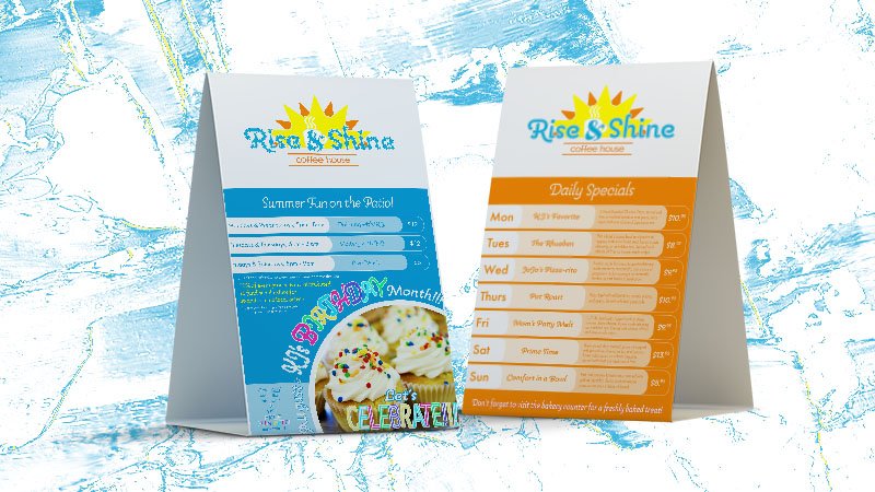
Menu & Table Tent
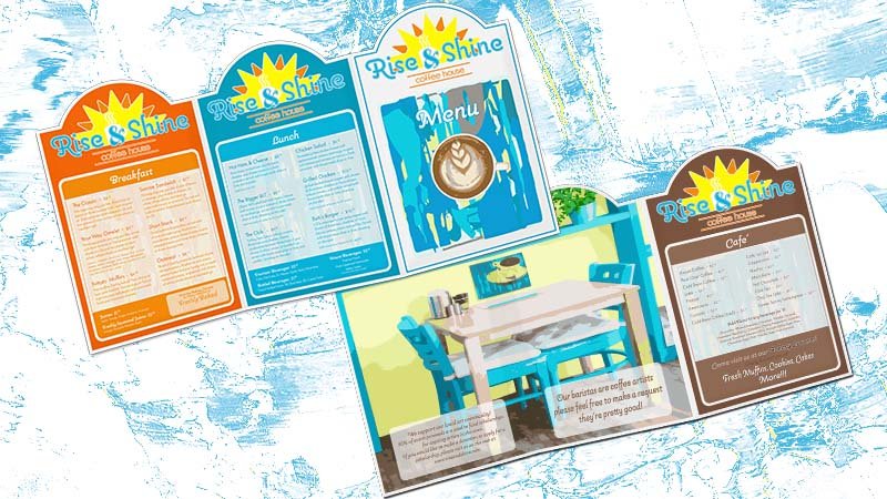
This is a z-fold menu which would be die cut via spot color at the top to encase the sunrise in the logo. You may notice that the image of the table and chairs is a recurring graphic in many of the pieces from this project. When I begin a conceptual design project, I first try to imagine the who, what, when, where, and why of the company.
I tend to create a space that has the general feel of the establishment in Photoshop to help it come to life. In this case, the PS image was transferred into AI for image trace and is representative of a painting of the shop created by the owner. This theme occurs within the context of the coffee cup, as well as that was placed on the wall in the shop, just above the table. Art is quite important in this environment, and this is simply a way to showcase the interests of the proprietor and the niche of the business.
The table tent is a two-sided layout that maintains consistency in branding and style while highlighting the shop's daily specials and upcoming events. And, yes, August absolutely is “birthday MONTH”.
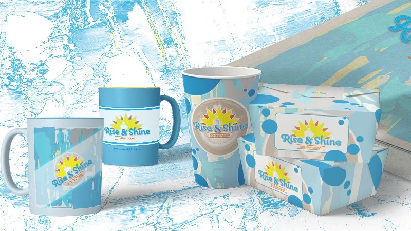
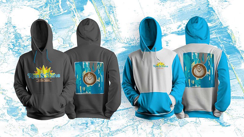
Packaging & Merchandise
I created designs for to-go containers that I felt represented the shop well, I also had die-cut bakery labels (not pictured here), and a few pieces of merch including coffee mugs and hooded sweatshirts. The branding is placed prominently on all designs, and other graphical content is kept consistent with what is seen in other areas.
Rise & Shine Coffee House caught on quickly with the local college and art enthusiast of Seattle. The time came to move into a larger space and regroup to suit the needs of the ever-growing number of patrons. For this purpose, I've created a package to help the company form a refreshed identity that matches their new aesthetic.
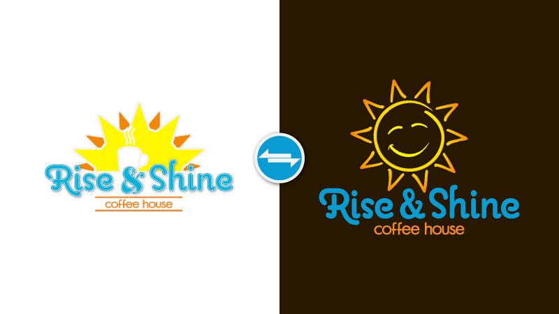
The New Logo
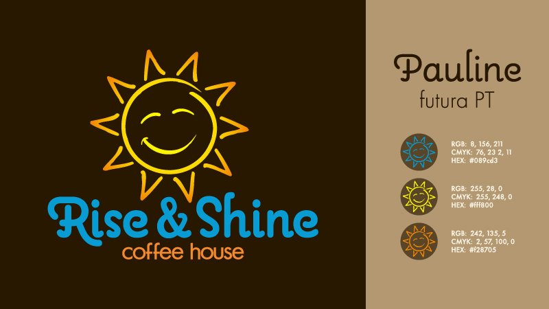
The refreshed logo maintains consistency with the fonts, color palette, and general idea of the original, but embraces a more simple, clean look. The logo would be available is solid color variants as well as black and white, in the case that the logo needed to be printed on an older or lower quality machine that is unable to handle the gradient.
Stationery Set & Merchandise
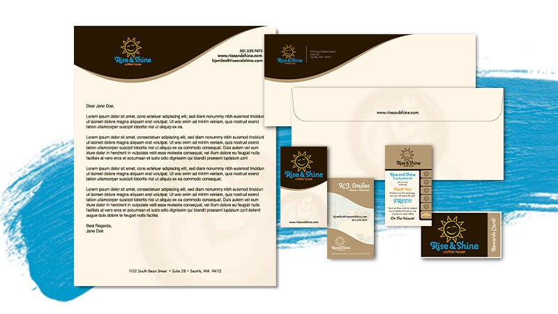
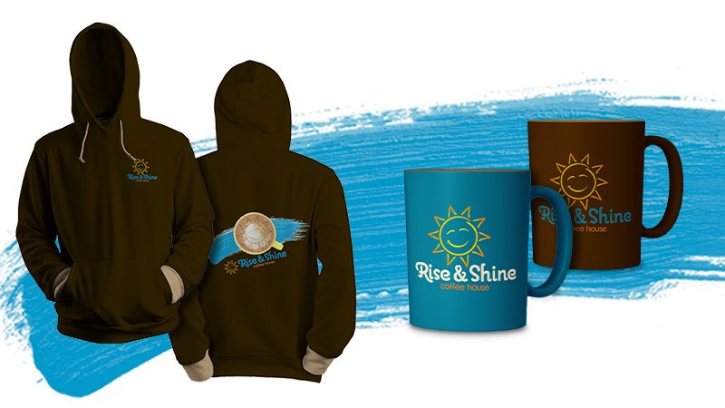
When I reworked this brand a while back, I decided that I should include a few essentials such as a matching stationery set along with a merchandising package to complement the new identity of the company. The goal was with this branding package was to keep a similar feel that can still be recognized while incorporating a fresh new look. While the gradient on the logo would be problematic for screen print and would need to be replaced, I have had excellent results using gradients for shirts printed using sublimation so long as the alpha channel is not altered.
Menu Refresh
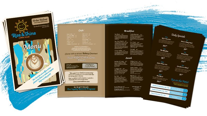
Finally, I added a new menu that leaves behind the decorative features of the old design to be replaced by a minimal, clean layout that incorporates the primary color palette with the newly refined secondary color palette. The design is simple as far as style goes; the typeface choices are consistent with branding as well as the old menu. I decided to move some of the information from the old table tent to be included in the menu, for example, the daily specials.