Project Type: Educational - Desktop Publishing
Role: University Student
Deliverables:

Pasta Amore is a first rate, no fuss, Italian restaurant chain that prides themselves on the quality of their product and a welcoming atmosphere for their patrons. It also happens to be the subject of my final project submission for my Desktop Publishing course.
I received a style guide, including logos & usage, the brand color palette, defined fonts, along with the company vision and mission statement. I was tasked with the creation of a two-page minimum restaurant menu, table tent (same image on both sides), and a brochure for this brand within the context of Adobe InDesign.
Pasta Amore's mission statement is as follows: "To provide a warm atmosphere for your family where we can share the traditional cuisines of Italy. Our food will always be fun, fresh and filled with love." My goal was to fully embrace this ideal, while presenting a well formatted layout for all print deliverables in a print ready PDF format.
Click any Image to Enlarge

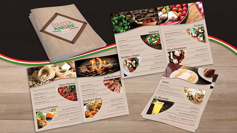
Main Menu Design
Though I understand the primary color palette's use of the Italian flag's scheme, I tried to focus more on the warm, inviting tones of the secondary palette, using the primary sparingly. I kept the menu simple, I used free stock photos to entice patron's tastebuds. Click on the mockup to see an embossed leather/vinyl outer cover with the menu spreads laid out in full view!
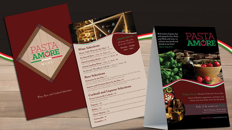
Beverage Menu & Table Tent
I decided to create a separate beverage menu as a complementary piece to the primary menu. The styling is consistent with the primary menu. This is a simple, two-sided laminate to help customers get their drink orders in early. The table tent carries the same basic styling, using a few of the darker colors. This is primarily used as a marketing tool for special offers, etc.


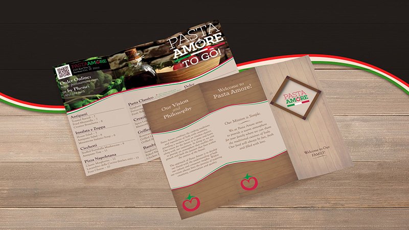
Z-Fold Brochure
The brochure is a two-sided document that features an introduction to the company's vision and mission on one side and a carry out menu on the other. I, again, stuck to the same stylistic elements for brand consistency and recognizability. The carry out menu features a QR code for easy online ordering, and a simplified version of the in-house menu.